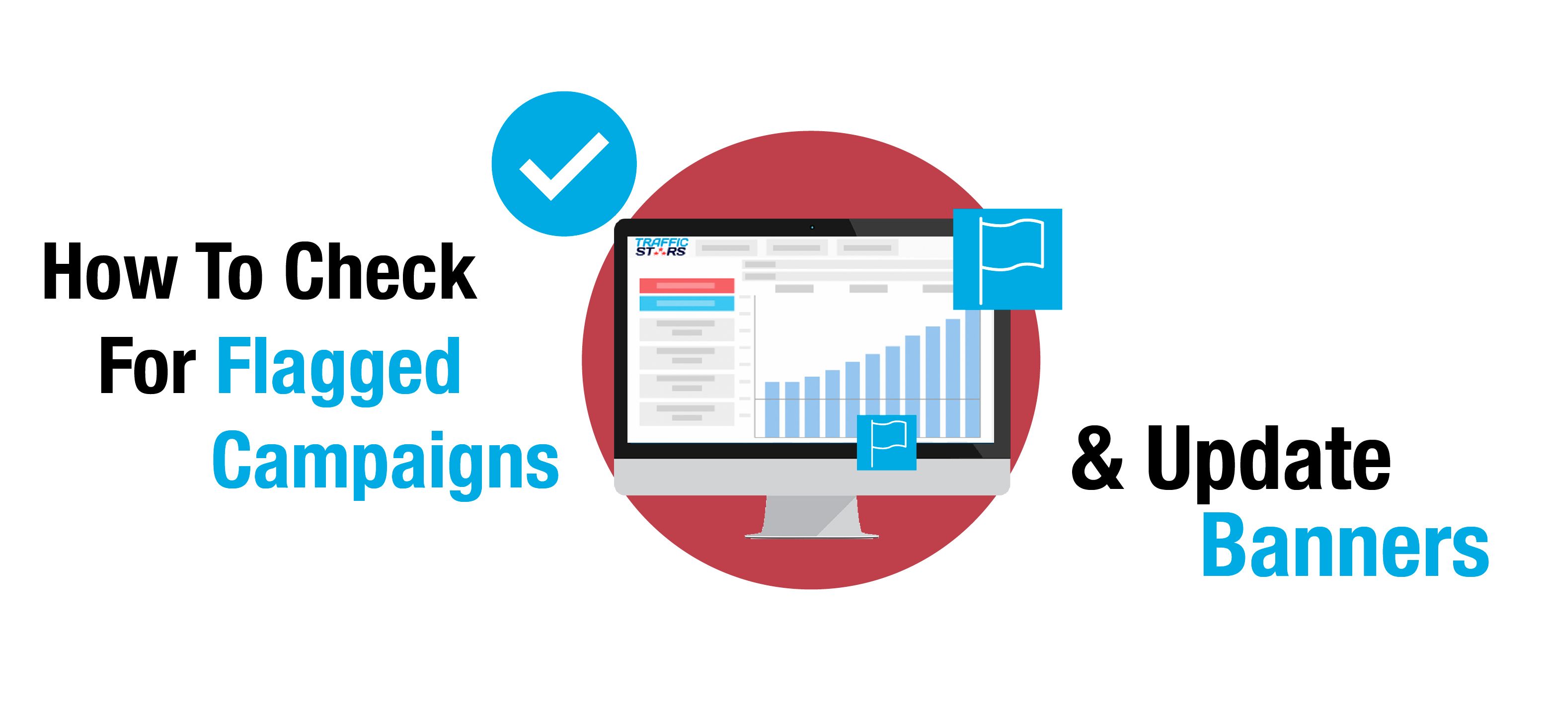
You’ve probably heard us speak about campaign flags before, but do you know what our campaign flagging system is? To break this down for you, we’ve asked our Account Manager Lucia Hanusova to help explain all about our campaign flagging system, the most commonly flagged creatives, why it matters to you and how you can use this information to improve your ad campaigns.
How does the campaign flagging system work?
Lucia: Our campaign flagging system allows publishers to easily choose which ads they wish to show on their websites and easily block the type of ads they don’t want.
Our compliance team apply different “flags” to ads, depending on what types of creatives they are. Our system then prevents your ad from showing on any sites or ad spots which don’t accept any of the flags applied to your creative.
This means that if you are targeting multiple ad spots, you may not be getting traffic from certain sources because the flags applied to your creatives are not accepted by that specific publisher.
When a campaign is flagged, you can check what the reason is and which ad spots do not accept this flag by clicking on the blue flag symbol next to each banner/URL in the Ads tab.
Why is it useful for advertisers?
Lucia: The flagging tool allows publishers to have control over which types of ads they want to allow on their site. This is especially important now in the wake of Google’s Better Ads Standards, as publishers need to make sure they are remaining compliant to the new policies.
Our flagging tool makes it easier for advertisers too; rather than completely rejecting a creative, your ads are automatically shown only in the ad spots which accept the specific flags applied to your creative. This means that advertisers know that they are competing fairly for traffic with the same standards that are applied to all.
Not all publishers have the same rules and they have the freedom to change which flags they allow when they wish to do so. This is good for a user who wishes to run popunders with autosound for example – something which was previously completely rejected – now, this user can run a RON campaign and the flagging system will automatically allow these popunders to run on all ad spots which accept autosound.
How can advertisers check what flags have been applied to their campaign?
Lucia: It’s very easy for advertisers to see if their creatives have been flagged by visiting the Ads Tab within a campaign. Once there, clicking on the blue flag next to the banner URL will show the reason why it was flagged, and a list of sites which don’t accept this flag.

If there are no sites listed, it means that all of your targeted ad spots accept the flag which has been applied.

What if I can’t see the flag icon in my campaign?
Lucia: If there is no flag icon next to the banner URL, that’s a great news! It means your campaign is fully compliant, and will run on all of your targeted ad spots.
What are the most common flags and what do they mean?
Lucia: The most commonly flagged creatives are:
Features that do not work – All ads that are considered misleading by the new Google regulations will receive this flag. The banner needs to clearly represent the experience that the user is going to have on the landing page. There cannot be any misleading elements, for example “View Photos Now”, if the user has to register before being able to view photos. Instead, please use something like “Register Now”, “Create Your Profile”, “Become A Member” or “Join Our Community”.
Fake calls, messages & notifications – This refers to any element on the banner that suggests that the creative is a message, text or response. Do not use any banner elements suggesting that the banner is any type of message, call, or other type of notification. This includes banners with messages written to address the user directly.
Aggressive Flashing – This refers to any animation with flashing/blinking or changing colour/backgrounds elements, as well as rapidly moving images. These types of ad are considered to contribute towards a bad user experience.
Misleading Exit/Closing button – This refers to an exit box or closing button that doesn’t work. Please remove the ‘x’ or “close” button from the banner, as it confuses users that would want to close the banner.
Entry Pop & Exit Pop – Both are considered as aggressive ads and most of our publishers do not allow these on their sites.
Auto Sound on Pop-up / Pop-under – This is a very common flag for popunders. All popunders need to be without sound, as otherwise they will be considered as an aggressive ad.
How should I improve my banners/creatives to get these common flags removed?
Lucia: There are many ways how to stay compliant and keep your ads flag-free. Please refer to the examples above, for example adding “register” or “join” to your banner if the final action requires user to register.
We also have many resources available to help in our blog and weekly newsletter, as well as guidelines and tips in our knowledgebase.
But please remember that you can always contact your Account Manager or Support Team, as we’re always happy to help you with your ads, and get any flags that you may have removed.


