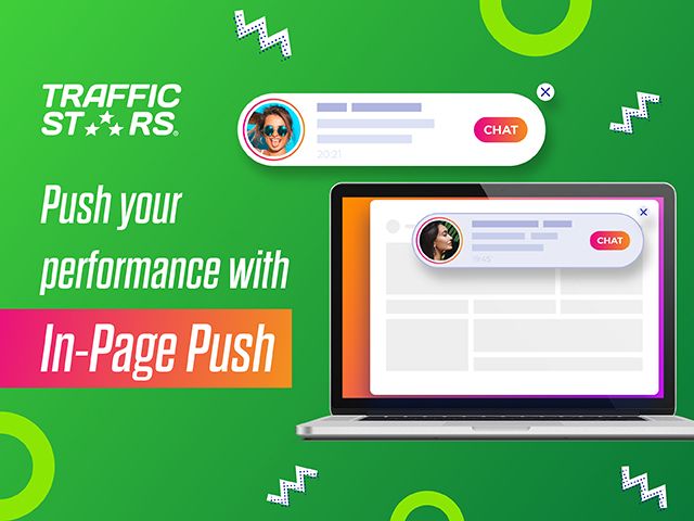
If you are concerned about the Google Chrome updates and the future of Push, don’t be, as there is a version of it, which won’t be affected and shows even better results than the Classic Push - In-Page Push. If you need a push on your performance, then this is a must test format. As engaging and eye-catching as the Classic Push, In-Page Push is a banner type ad which resembles a message while the visitor is browsing the Publisher's website. What makes it even more appealing is that for some of the top verticals TrafficStars created a unique design which drives higher user interest and engagement.
What is the difference between In-Page Push and Classic Push? In-Page Push is highly engaging just as Classic Push, but It is a not intrusive ad format and you do not need a user to subscribe in order to receive your ad. Moreover, it does not depend on the browser and you can reach your audiences on any device and all Operating Systems, including iOS.
Benefits of In-Page Push
- Custom design - We created new unique designs for top verticals such as Dating, Webcams, Gambling, VPN & Antivirus, which increased user engagement and interaction
- Higher CTR and CR - The new interactive designs delivers more legit clicks to your offer
- Engaging - Just like the Classic Push, In-Page Push resembles a message, which allows you to better communicate to website visitors
- No need of pre-collected user base - Unlike Classic Push pre-collected database is not needed and user doesn't have to subscribe in order to receive the notification
- Works on all browsers and platforms - It works on all browsers and platforms including iOS.
Top GEOs
The highest conversion rate is currently in US, DE, GB, FR, BE. Huge volumes we have from JP, IN, ID.
Top Verticals
After significant testing, we decided to create unique designs for the top verticals which convert best on In-Page Push - Dating, Webcams, Gambling, VPN & Antivirus, which boosted even more the performance.
In this case study we will show you more details on one of our test campaigns. With one of our top partners we tested a VPN offer. The GEO we decided to test for the case study was the United States.
Case Study Data:
Offer - VPN GEO - US Campaign duration - 01.06.2021 - 15.06.2021 eCPM - $0.045 eCPA - $2.12 Spend - $359 Earnings - $620 Income - $261 ROI - 73%
Campaign Set Up
Targeting
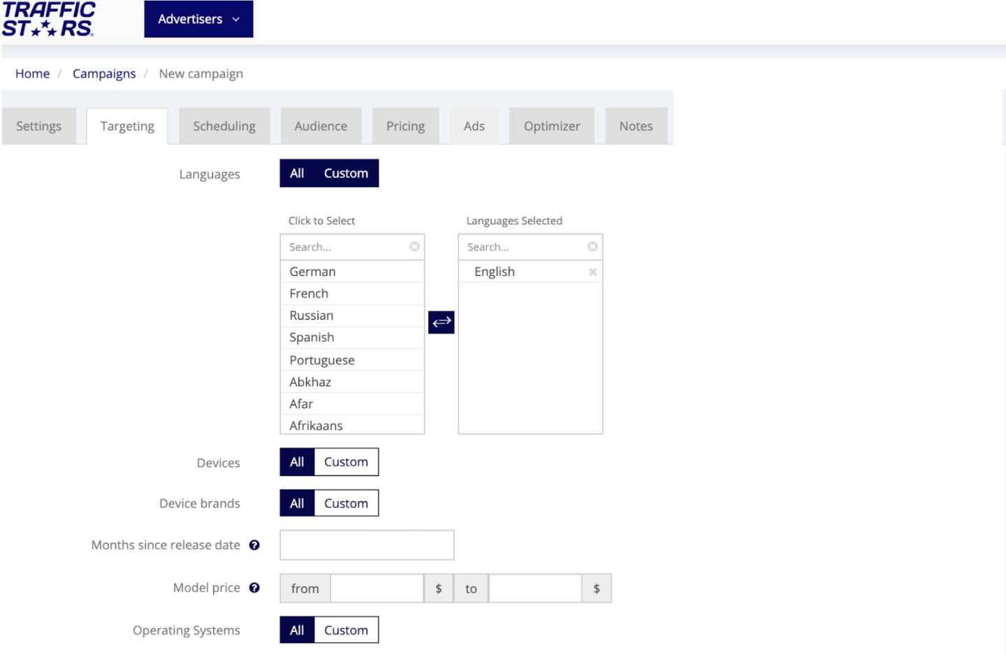
We started the test with a wide targeting, only choosing the country we wanted to target - the United States and language - English. To choose only In-Page Push, we selected it under the Push format option in the Settings tab.
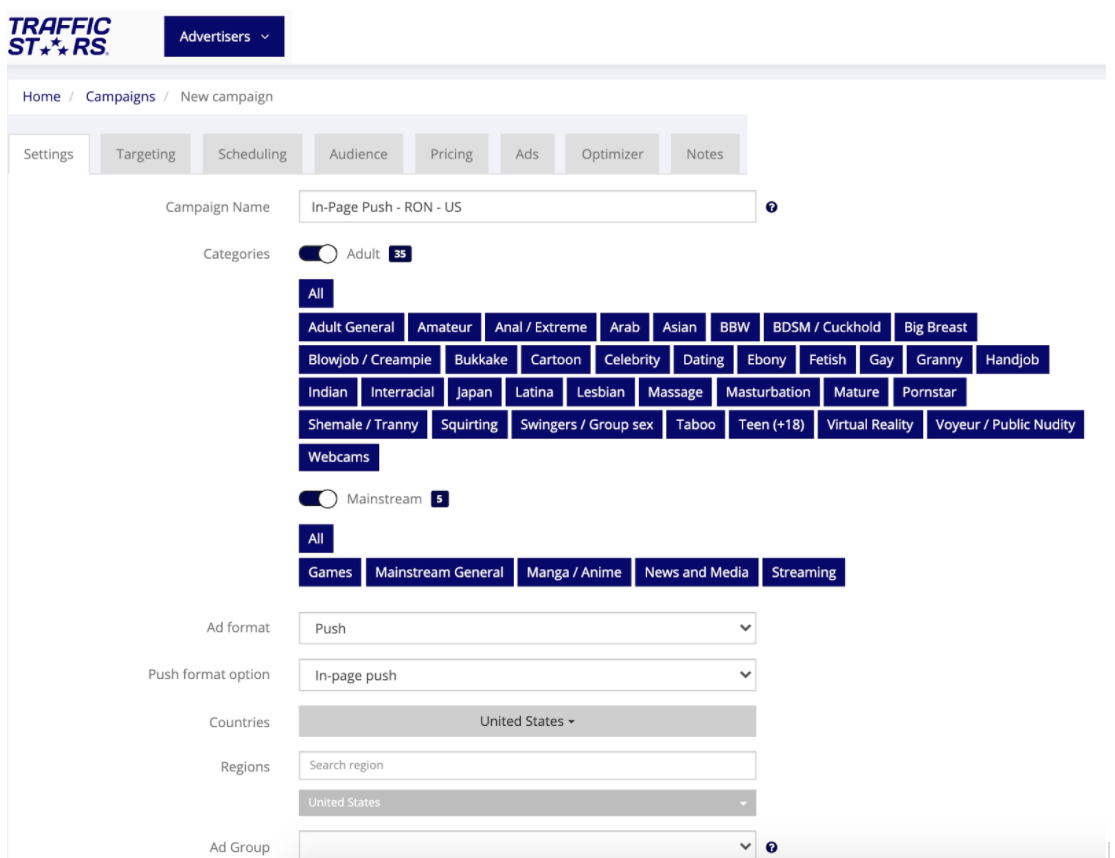
Initially, we tested all devices, OSs, browsers in order to gather enough data. Further, we analyzed the resultsstats and we were able to get even better results after we optimised by device and spot.
Audience
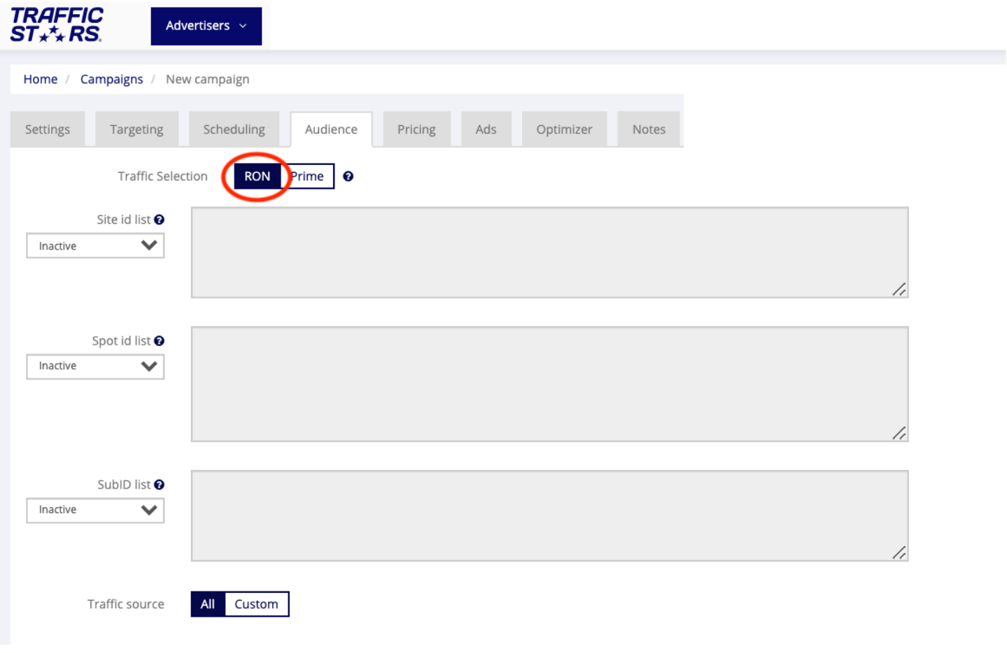
For the initial test we set up a RON campaign, targeting all sites and spots, which was further optimised according to the best converting spots.
Pricing
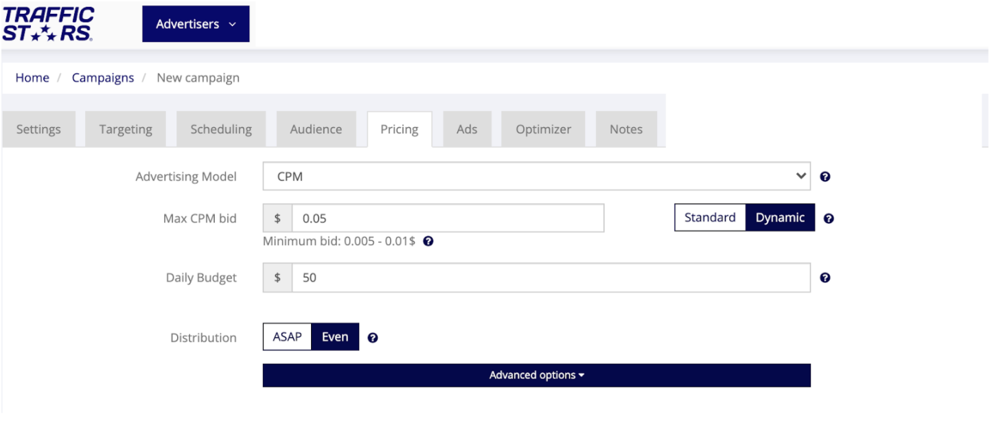
We decided to run a campaign on a CPM advertising model. We set up a Dynamic CPM of $0.5.
After a week, we optimised the price for each ad spot according to the results. We increased the bids of the best performing spots and the ones which were not receiving enough traffic and decreased the bids of the spots with higher eCPA and lower CTR.
We set up a daily budget of $50 and selected EVEN distribution to ensure that the campaign will receive traffic during the whole day.
Creatives:
We used clear images with strong CTA. We A/B tested different types of creatives, headlines and titles. It is important to use images relevant to the offer, so when the user clicks on the ad to land on a landing page he is expecting to see.
Also a very important part is to change the creatives every 3-4 days, so they don’t burn out. Test new images, similar to the best performing ones and keep a “bank” of winning creatives.
Some of the best performing titles for VPN offers are the ones which create a sense of panic, grab the attention and trigger an action. Always use the local language, add emojis and macros for higher engagement.
For the headlines we used a short and clear description of the offer, which describes the benefits.

Optimisation
Spot Optimisation:
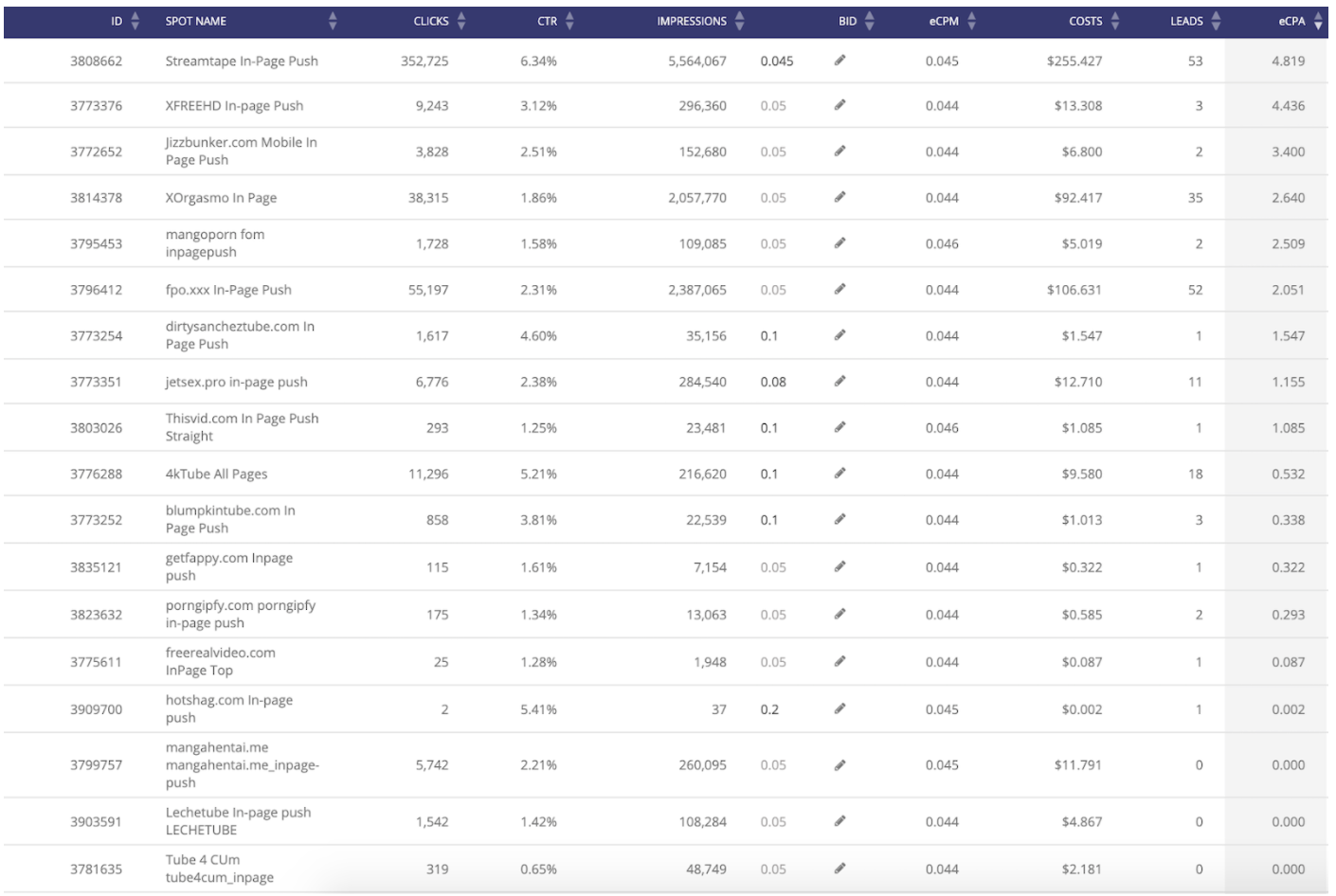
After testing with the above recommendations for a week, we started optimising the campaign. We analyzed all the gathered data and identified the best performing spots, devices and specific targeting.
We have full transparency of the sources we have available. We can easily optimise straight from the Stats on the platform, if we have implemented S2S tracking, which allows us to see leads and eCPA in the statistics on the platform.
After analyzing the data, we either decreased the bid or paused the non-converting spots, which had low CTR and a lot of impressions. We increased the bids for the spots which didn’t get much traffic, so we can check their potential too. For the best performing spots, we adjusted the bids according to the results.
Targeting Optimisation:
From the statistics it wаs clear that mobile and tablet devices convert much better and most of the traffic on In-Page Push is mobile, so we continued targeting only mobile and tablet:

At the end, after the optimization we managed to reach 73% ROI and pure profit of $261. During the test we gathered enough information and we’ve listed the best performing combinations and optimisation tips, which you can see below.
Tips:
Creatives:
- Use clear, uncluttered image
- Attractive / Bold Image (capture attention)
- Relevant to offer
- If using people - use photos of real people !BURN OUT!
- Creatives can burn out in 3 - 4 days
- Upload new creatives
- Keep a “bank” of winning creatives
Brand Name:
- Introduce your offer → short & concise
- No more than 20 characters
- Bold so grab users’ attention
- Acts as a CTA (Download / View / Buy / Click)
- Test Emojis (if relevant)
- Capitalisation (recommended)
- Use “power words”
- Use macros
Headline:
- Describe the offer / benefits
- Call to action
- Use “power words”
- Maximum 25 characters recommended
- Use emojis to convey urgency / offers / relevant info (maximum of 2 suggested)
- Create a sense of urgency (time - sensitive offers, tech issues etc.)
- Use macros
Optimisation tips
- A/B test!
- Test different Texts
- Test different images (more bold / different angles / contrasts / more shocking)
- Test different emojis, which correspond to the offer
- Test different combinations
- Use creatives that are similar to the “winning” creatives with slight variations (flipping / different borders / similar images)
- Collect enough data with RON campaigns
- Always optimise via ad spots - blacklist ad spots which didn’t convert
- Optimize your bids per spot throughout the whole period of running your campaigns
- Create prime campaigns for best converting spots at a higher bid & winning creatives
- Keep a RON campaign on minimum bid and appropriate daily budget so you don’t miss new spots
- Analyse hourly statistics & introduce time scheduling for best converting spots to reach users in real - time / best time (e.g. in US = US schedule)
- Use Frequency capping - Don’t overload users with same creative RON - set Frequency capping 1 and use multiple creatives (at least 4-5) Prime - use best converting creatives and FC 1 or 2 if you have more than 5 creatives or 2 or 3 if you have less than 5 creatives


.jpg)
